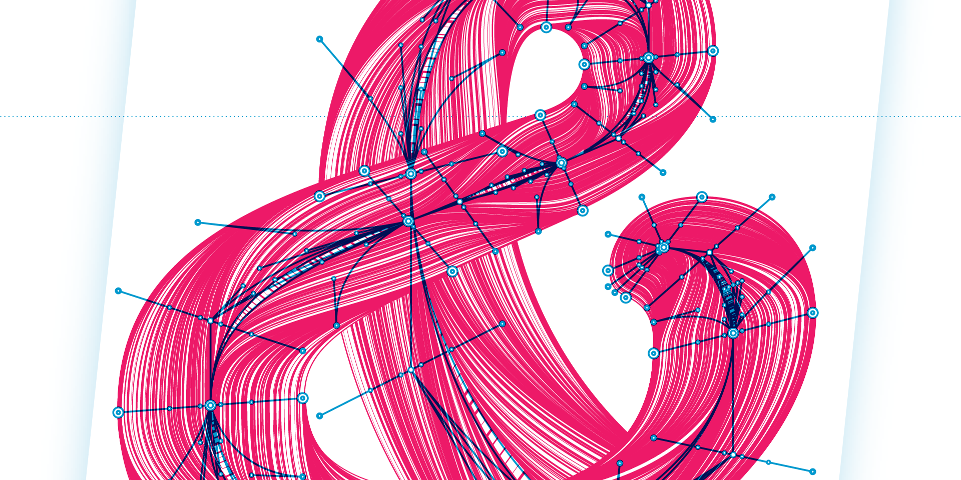
Introducing Kermit
A Typeface for Kids
Using typeface design to empower children by making reading easier, improving comprehension, and helping dyslexics
— Rob McKaughan (Microsoft)
Imagine having never ridden a broom with the chosen one they call Harry Potter, or stumbled through a closet and into the mystical land of Narnia. For kids that discover the magic of reading through books like Harry Potter or The Chronicles of Narnia, reading is a gateway to otherworldly realms where your only limitation is your imagination. But, reading isn’t easy for everyone. It’s estimated that 1 in 10 people have some form of dyslexia, often undiagnosed. Children with dyslexia struggle with simple reading tasks like sounding out words, making it difficult for them to read.
To help young readers of all skill levels, we’re introducing Kermit, a child-friendly typeface created by the type design studio Underware. Kermit is a friendly and approachable font that encourages children of all skill levels to read, even if they are anxious about their abilities. It is a powerful example of just how much design decisions matter: Associating typographic weights and widths with verbal inflections could improve a child’s comprehension, or employing Variable Fonts for animation may help severe dyslexics start their reading journey. Combining science and design creativity can improve a child’s confidence in reading, changing their trajectory in life. Kermit is, therefore, more than just a typeface, it is a platform for exploring new, science-based methods of helping children read.
Learning to read is difficult: the process involves nearly every part of your brain, and you had to train for years to do it effortlessly. For some people, though, reading can be like navigating a confusing highway filled with detours. Children who struggle to read often have low self-esteem and give up, limiting their creative potential and intellectual curiosity. Any help we can give children can be huge – even if we simply make words look more friendly.
Designing for early readers
Ever had your mood lifted, your burdens lightened, and your confidence boosted by someone’s encouraging words, or a stranger’s smile? We’ve all experienced that boost and science proves it. Being in a good mood improves our performance on creative cognitive tasks.
For Underware designers Bas Jacobs, Akiem Helmling, and Sami Kortemäki, making Kermit fun and playful was a way to put kids in a good mood, making them interested in reading. Therefore, the design had to be informal and relatable like handwriting.

Kermit was designed for children to easily read, making legibility a priority. Underware imbued Kermit with a large x-height, thick strokes, generous spacing, and familiar letter shapes, striking a perfect balance between the informality of handwriting fonts and the structure and readability of classic book typefaces like Garamond or Avenir.
Making Kermit enjoyable – and with support for 426 languages based on Latin, Greek, and Cyrillic alphabets, children worldwide can enjoy it – is good, but we wanted to do more by trying out new ideas coming out of the scientific community.
Showing how to read expressively
Remember when you were a kid, having to clean your room, mowing the lawn, or maybe take out the garbage? You probably heard your parent ask one of the following questions:
Did you take out the garbage?
Did you take out the garbage?
Did you take out the garbage?
All three questions use the same words, yet they have different meanings. When we speak, we inflect our voice to add more meaning. You might make your voice louder, or pronounce a word slowly, or raise your pitch. These inflections are called prosody. Unfortunately, almost all prosody gets lost when we write because we have no notation for it.
Ever had an email misunderstanding because people couldn’t tell you were being ironic? That confusion doesn’t happen as much in conversation because prosody makes the irony clear.
Researcher Ann Bessemans wondered if there was a way to represent prosody in written text. She found that when you represent pitch, volume, and duration typographically, children read out loud more expressively, with correct prosody. She also found that it even worked for children and adults who had hearing impairments. Even better, a preliminary, yet unpublished study is finding that adding prosody to text improves children’s comprehension.
Inspired by the possibility of helping kids read expressively and improve their comprehension, we designed Kermit to represent prosody: employing boldness to represent volume, width to represent duration, and shifts letters vertically to represent pitch. It looks unconventional, but once you get used to it, it’s easy to read text and hear all the nuance that a performer would add.

Great oratory is very expressive. When we caption videos such as Franklin D. Roosevelt’s first inaugural address using conventional text, it loses a lot in translation.

Adding prosody to the captions enables you to experience the full power of the performance – even if you can’t hear a single word.

While we haven’t implemented automatic prosody yet, Kermit allows us to explore expressive writing to elevate comprehension for children and adults alike.
Helping severe dyslexics
Dyslexia is a very active area of research. Fifty years ago, people thought dyslexics saw letters backwards. Now, it’s primarily seen as a phonological problem, in which dyslexics have difficulty with sounds in language. The most successful dyslexia programs to date focus on teaching phonemic awareness (e.g. that the spoken word “cat” has three sounds) and phonics (mapping letters to sounds). This success might make it seem like dyslexia is all about sounds, but it’s not clear yet if phonological problems are dyslexia’s cause.
In 2010, researchers Trichur Vidyasagar and Kristen Pammer suggested a new theory on the cause of dyslexia: Dyslexic brains might have issues with visuo-spatial processing. In other words, dyslexic brains may process visual information differently, making the order of letters unclear and reading difficult.
To understand this, let’s take a trip inside your brain. Light enters your eyes and shines on the retina. The retina processes the light, sending neural signals on a long journey from your eyes to the back of your head where your brain processes images, and then forwards through the visual cortex.
This journey takes two parallel paths: the high road and the low road – literally. The high road, or dorsal pathway, physically runs along the top path through your brain, carrying information about where things are, such as the sky is up, pavement down, or the order of letters on a page. It is the “where” signal.
The low road, or ventral pathway, runs below the high road, carrying information about what objects are, e.g. the blue thing is the sky, the grey thing, pavement, and the two lines leaning against each other with a crossbar is an A. It is the “what” signal.
These two roads meet at a little neural town called the Visual Wordform Area, which combines the “what” and “where” signals to form words – hence the name. This is where we recognize words.
This neural town has a big spotlight in it, controlled partially by signals from the high road. As we read, the spotlight should smoothly move from one letter to the next, focusing our attention on a letter from the low road, identifying it, then moving to the next. If anything goes wrong along the high road – and there are many things that can go wrong – the spotlight will not move smoothly or focus attention as well, disrupting reading.
According to Vidyasagar & Pammer’s theory, dyslexics may have something wrong in their high road, weakening signals about letter locations, making it hard to understand the order letters are coming on the low road, which makes it hard to recognize words.
This smooth spotlight movement is something we have to learn. Before we learn to read, our eyes and attention unconsciously flit about painting a picture of our world. The more we read, the more we train our brain to control our spotlight smoothly. But, if a child can’t recognize words due to weak high road signals, they won’t read as much. The neurological systems needed for proficient reading won’t get exercised, but they will get exercised in neurotypical classmates who read more. The dyslexic child gets left behind.
When these systems are underdeveloped, a child may not develop strong phonological associations or smooth visual scanning (remember, our eyes and brains have to be trained to do this; it isn’t natural). The number of potential issues along the high road might explain the variety of dyslexia subtypes.
So, what does all of this have to do with a font? The high road doesn’t just carry location information; it carries motion signals, too. Adding motion to letters might boost the high road signal, helping dyslexics get control of their spotlight of attention and improve their reading.
We created a special version of Kermit that is animated, with letters that draw themselves.
A font that draws itself
How do you create an animated font? Because Kermit is built as a Variable Font, it is not limited to Light, Regular, and Bold styles. It can produce any level of boldness thanks to Variable Font technology.

But the technology isn’t just for typography. It can vary color, style, or even change a letter’s shape over time, making the font animated. The math behind Variable Fonts, called linear interpolation, makes animation awkward because points on the letter’s outline must move in a straight line at a constant speed. Natural-looking animation through curves needs to use a higher order of mathematics.
As a workaround, you could move points along many tiny lines so they seem to flow around a curve naturally; however, that would require designers to draw dozens of versions of each letter – like cartoon animators of the 1930’s–1970’s, painstakingly drawing 24 pictures for every second of film.
Luckily, Kermit’s designers had a clever mathematical idea: they combined independent linear parts of a Variable Font to create higher order math. They call it Higher Order Interpolation, or HOI for short. (Fun fact: In the Netherlands, where Underware is based, “Hoi” means “Hi”).

That breakthrough enabled the designers to create smooth animations that accelerate, decelerate, and turn corners with the control of an old school animator, without having to draw thousands of pictures. This makes Kermit’s animation feel like it’s naturally drawing itself with a pen.
We hope this animation will strengthen the high road signal in dyslexics, helping them better understand letter order and more easily recognize words. That could enable them to spend more time reading and training the neural pathways for reading. We are still testing this idea and will release the animated version only when we can scientifically prove its benefits.
Empowering children
Writing systems, which are over 5000 years old, are one of humanity’s greatest inventions. Like magic, or telepathy, they transmit ideas and creativity across the globe and across generations. It is one of the ways that we express our humanity. Now, it’s time for an upgrade. Time to take advantage of our latest technologies and research to empower more children to read.
In designing a child-centric font for reading, we hope to support children learning to read. Our mission is to make reading enjoyable, valuable, and accessible to everyone. We explore new frontiers with the animated version of Kermit, new methods of research-based expressiveness, or simply making reading look fun and easy to all kids, regardless of reading skill. The power of reading sets a child’s imagination on fire, where no movie or technology can surpass the theater of the mind. Reading gives children agency and ultimate confidence. It impacts the trajectory of their lives: from their academic performance in other subjects, to future job prospects, to their self-image and whether or not they feel incompetent or capable. Every child deserves the opportunity to thrive and we are dedicated to trying new ideas and old to help them. We hope that this first release of Kermit is the next step on that journey.
Time to play
In other words: how Kermit – a new Microsoft font family – pushes the boundaries of typography, why Underware has been dreaming for decades of writable fonts, the misery of the Bold button, the appeal of informal letters, the Copernican Revolution, the introduction of the time dimension in a font, what’s in the air, and why fonts should have a play button.
— Underware
Introduction
Microsoft’s 50th anniversary is marked, among other things, by the introduction of a new font in Office: Kermit. At first glance, it is a friendly-looking, informal font family, but on closer inspection it’s a combination of unique aesthetics & state-of-the-art technology that leads to a new way of writing.
Designed and produced by pan-European design collective Underware, Kermit is a groundbreaking design because it offers capabilities that no other font family has so far. Kermit is a writable font – a typeface that can be written as one writes by hand: stroke by stroke, in the correct order, at the right speed, at the right time. This innovative design enables new digital reading experiences, for example as support for learning to read.
Type design today offers many more possibilities than before, is no longer limited to a two-dimensional world, but can be multi-dimensional with unlimited possibilities. Like many before them, Underware has been dreaming for years of a different way of writing, where ductus, modulation and speed variations are natively part of the design, of strokes that flow in time and space, freeing letters once again from their typographic straitjacket. Kermit is a small step in that direction. But since this new font family was designed specifically for a software environment, let us first reflect on the relationship between fonts and software.
1. Relationship between fonts and software
Kermit is part of the Microsoft Office environment, software from Microsoft that has millions of users worldwide. The Kermit font family is itself software, which in turn functions within other software. Type foundries today do not enter the metal industry, but the software industry. Any company that publishes typefaces ends up publishing software. Software applications and typefaces have had a close relationship since the very first digital developments in the 1970s, and have mutually influenced each other.
Since Kermit moves outside existing conventions but is also part of Microsoft’s Office, this is a good time to first examine what software from major technology concerns has meant for current typographic conventions and general typographic awareness.
The emergence of a general typographic awareness
Software from major technology corporations has played a significant role in creating typographic awareness among the general public. Due to the widespread use of this software, a large public has become familiar with font menus. Millions of people are compelled to choose a specific typeface daily, making typography no longer a niche expertise known only to professionals. Typography was not something an average person was aware of, let alone actively engaged in, until the introduction of the PC. Until the 1980s, typography rested in the hands of designers and typesetters at printing companies, who shaped submitted copy into suitable formats.
The introduction of the personal computer caused a turnaround and made an average person not only write texts, but also format the final version themselves – something unprecedented in the history of typography. While typewriters had existed for over a century and allowed writers to format their texts, these were merely drafts, and the typographic options were so limited and tied to the device that it could hardly be considered true design by the writer. A greater general typographic awareness only really emerged in the 1980s and 1990s with the introduction of personal computers by Apple and Microsoft.
If there is one font that has become the symbol of this greater general typographic awareness, it is probably Comic Sans. This font, made famous by the introduction of Windows 95, has since gained a worldwide reputation. The Windows operating system has been around for 40 years, and today, around 70% of desktop computers globally run on a Windows operating system. The most recent version of this operating system comes with more than 500 fonts as standard, supporting an extensive set of writing systems. Besides Latin, standard fonts on the desktop computer now include support for many other scripts – such as Arabic, Thai, Cyrillic, Chinese, and Hebrew – making the desktop computer a much more universal tool. This was a far cry from the situation 40 years ago.
A very widely used and therefore influential version of an operating system was Windows 95, introduced by Microsoft in 1995. It featured a typographic palette that, even at the time, was already about 20 years old (based on the palette of the WYSIWYG editor BRAVO from 1974). This palette consisted of seven font families: Arial, Comic Sans, Courier New, Marlett, Symbol, Times New Roman, and Wingdings. The typographic options on Windows 95 were minimal: one sans-serif family (Arial), one serif font (Times New Roman), one monospaced font (Courier New), and three symbol/icon fonts. Among this sober, businesslike, and functional selection of fonts, but one stood out: Comic Sans.
Due to its commercial success, Windows 95 was used on a massive scale – rough estimates suggest 200 million users. It became the first operating system to introduce a graphical user interface to such a large audience, achieving a level of impact no previous system had matched. First of all, the presence of a font menu in software programs made a very wide audience aware of the existence of different fonts. This made life a lot easier for type designers, who could suddenly make it clear at birthday parties what they did professionally: I make typefaces. Fonts? Like the fonts in your menu. Ah!
In the 1990s, millions of people were suddenly confronted daily with the ability to choose their typeface for their text – something previously determined by someone else. This created a new avenue for self-expression: typography transitioned from a paternalistic system to a manifestation of individualistic statements. Because this shift happened on such a large scale in the 1990s, and because the range of available fonts was still limited, a typeface like Comic Sans suddenly gained notoriety.
Many remember that period as a time when only four types could be chosen:
- The Manager - sleek and boring (Arial)
- The Office Worker - serious and dutiful (Times New Roman)
- The Nerd - a strange typewriter letter (Courier New)
- The Party Cracker - the one with a bit of a nonchalant, outspoken character, one of those who do feel like partying (Comic Sans).
A pop band of 4 musicians: three grey mice and one real crowd-pleaser front and centre.
The lack of typographic self-expression provided fertile ground for Comic Sans, mainly because of the need for an informal communication style. It was simply the only typeface of these four with which people could identify if they didn’t appear as the manager, the office worker or the nerd – in short, if they didn’t want to be boring. Human beings are complex and multifaceted creatures. With that, it also made sense in retrospect that many people identified with this very typeface, the only human font in the set, and began using it extensively. Often inappropriately, but that’s another story.
Today’s typographic options have expanded considerably. Calibri replaced Times New Roman as the default font within Microsoft’s software in 2007, it was succeeded by Aptos in 2023. The days when only a handful of fonts could be chosen are thankfully far behind us, and so the impact of those few famous fonts, including Comic Sans, from Windows 95 has faded as well. However, before a much more extensive and varied typographic offering came along, Comic Sans had already become the symbol of the maternity phase of general typographic awareness by having such a huge impact on the visibility of typography as a cultural phenomenon. The font menu ensured that every computer user in the world became aware of typography, and Comic Sans ensured that everyone had an opinion about it.
However, this somewhat clunky-looking design is no longer a hot topic at birthday parties, there are no more global protests to ban Comic Sans, and the large-scale public hostility is now a thing of the past. In a supply of hundreds of fonts, there is no longer one that easily stands out and thus evokes such widespread antagonism. What does remain, however, is the need for informal communication, alongside all business and serious communication. Perhaps the accessible Kermit can meet this need.
With its extensive typographic palette (a wide spectrum of weights and widths), Kermit can solve complex design problems while maintaining an easy-going personality. It is a skilfully crafted typeface family that combines expertise with an informal appearance. While Kermit isn’t quite the party cracker that Comic Sans was, it remains informal enough for moments when personal expression is needed.
Stuck in the frame of the B-button
The typeface Kermit contains an extra dimension: time. Kermit can be played back, much like a movie. It would therefore make sense if every application had a play button so that a text could be played or written. Unfortunately, this is not yet the case. Many applications, however, do have a B-button. It no longer needs any explanation that clicking the B-button makes (selected) text bold. The B-button, representing Bold, has become so standard that it is now an inseparable part of any software offering typographic options.
Many are familiar with these buttons from MS Word, which is now part of Microsoft Office. A Regular is thus paired with a Bold style. As obvious as it seems, this Bold button is not. Back in the days when letters were not made digitally but in lead, it wasn’t a given that every typeface would automatically come with a bold variant. Today, however, it is almost unthinkable for a new font family to be presented with an italic only, without a corresponding bold version. The influence of the B-button on this phenomenon within typeface design should not be underestimated.
The history of the B-button in the user interface starts in 1974 with the aforementioned, first-ever WYSIWYG word processor BRAVO. This program, developed at Xerox PARC, introduced early on the option to format text. Selected text could be made bold – not via a button, but through a key command. The key combination was invisible in the interface, but the result appeared directly on the screen.
MacWrite, the text editor Apple introduced in 1984, included the same functionality, but in addition, text could also be made bold via the drop-down menu. This marked the first time the Bold function was visually present, though still not as a button. That same year, Microsoft Word 1.0 for Mac introduced a dialog box alongside key commands, allowing text to be made bold. Only in 1989, with the introduction of MS Word 1.0 for Windows, was this feature provided with a button in the user interface. Since then, the B-button has been an integral part of Word and many other programs.
 The first Bold and Italic button in a user interface, MS Word 1.0 for Windows (1989)
 For demanding users, such as graphic designers, the B-button is an inconvenient and restrictive obstacle. Even type designers often find the B-button an eyesore. If there is a need for more complex typography, such as more weights than just a Regular and a Bold, a problem immediately arises with linking the various styles. For example, what if the font family also includes a Light, Semibold, and Extrabold? Should the Light then be linked to the Semibold? Or should the Semibold be coupled to the Extrabold? This style-linking restriction poses problems for both the discerning user and the professional creator of fonts, so they often avoid it. The average user of a word processor, however, is thrilled with the ease of differentiating by clicking a button and has no trouble whatsoever with its additional limitations. Since the button is perfectly suited for everyday tasks – letters, theses, reports, minutes, notes, invitations – it is impossible to imagine modern interfaces without it.
Often the Bold button is frequently accompanied by the adjacent Italic button, and they are presented as a pair. Because the Bold and Italic buttons have become the de facto starting point of typographical options in a user interface, they shape the framework of how people think about typeface families. First of all, this creates an expectation in users that a family always has a bold and an italic (and by extension, a bold italic). Software users operate within this framework of digital text, taking the Bold and Italic functions as a given. These two buttons have become the standard way for millions of people to differentiate texts they type digitally themselves in word processors.
The resulting RIBBI framework - Regular, Italic, Bold, and Bold Italic - then also dominates how type foundries develop their fonts. In a nutshell, the RIBBI framework forces type designers to think in (simplified) design spaces. Long before the B-button, type families were developed where the relationships between them were consistent – think Frutiger’s Univers (1957) – but the RIBBI framework has only reinforced this ’design space thinking’. Kermit doesn’t stop at just Regular and Bold; it includes seven different weights, each with an accompanying italic. As obvious as this may seem these days, such a setup for a font family is a further elaboration of the RIBBI mindset. The RIBBI way of thinking ensured that a font family not only always features an italic, but also at least one additional weight. The current approach to designing fonts is dominated by the RIBBI perspective. User interfaces define our thinking about fonts.
Fantastic ideas from type designers sometimes fall by the wayside because they do not fit into the RIBBI straitjacket. For example, a second italic may be a great idea for a font family, but there is no second I-button to make it directly accessible. This requires the user to step outside their usual framework to use it – something many users find a step too far. And a Semibold or Extrabold can add value, but requires an action by the user outside the B-button. Browsing through a font menu, for example, that is often a bridge too far for the non-professional, less demanding user. In any case, it is less user-friendly than clicking a single button that is permanently in view. Who knows how many good ideas have been killed in advance because they weren’t RIBBI-proof?
Marshall McLuhan’s 1964 phrase “The medium is the message” has been frequently applied within various fields to make it clear that the medium itself - and not the message it conveys - shapes and controls our thinking. The same can be said for typography in the context of software environments and associated graphical user interfaces. The interface presented to us determines our way of thinking: we no longer work only within the boundaries of the software we use, but our thinking is limited to the possibilities presented within it. Widely accepted conventions, such as the B-button, are often no longer questioned, if only because of the ease of use they provide.
Interestingly, many software applications that have gained widespread adoption over the last decade – particularly social media apps – no longer feature bold or italic buttons. This absence could eventually lead to a new standard framework for thinking about typography and type design. Most social media apps do not offer any typographic options for formatting digital text, forcing users to find alternative ways to create distinction (ignoring for the moment the options to convert text to image, and then decorate). There are even fewer typographic options in those social media apps than on an analog typewriter, where text can at least be crossed out or underlined with a repeated line. Instead, users on social media rely on strategies like ALL CAPS, ***placing words between asterisks***, or adopting writing styles with more whitespace and deliberate spacing – all of which operate within a single font style. The question is: if such software becomes dominant, will it change our framework for thinking about typography? Will the absence of the B-button lead to a decline in typographic richness? Or will it open the door to ideas outside the current framework, allowing brilliant concepts that are currently discarded to flourish because typography is approached with fewer constraints?
Suppose Kermit were designed 20 years from now, at a time when the current text editors had been replaced by extremely limited social media apps, would this font family have a completely different set-up? Maybe just a single weight with a play button?
Fonts and interface are one
Typography is itself an interface, allowing the reader to take in a text. But typography is again shaped by using an interface, in a software environment. Typography is an interface created through an interface. In other words, both interfaces are more linked to each other than it first appears.
The influence of interfaces on fonts should not be underestimated. But does the reverse also hold true? Can fonts also influence user interfaces in software applications? Recent font formats, such as Variable Fonts and OpenType, have – unfortunately – not yet led to a new standard in user interface design. In fact, after 25 years, we are still waiting for the first application to design a proper interface for OpenType features. And the only contribution Variable Fonts have had so far is the addition of some sliders, despite their much broader potential. How different was the impact of PostScript fonts?
PostScript too – like BRAVO – has its origins at PARC, Xerox’s research institute, in the 1970s. Much computer technology we use every day today has its origins there: the laser printer, word processors, the graphical user interface and also the PostScript font format. John Warnock, then an engineer at Xerox, developed a language called Interpress to control laser printers. After failing to convince Xerox to commercialize this technology, he left the company with his boss, Charles Geschke, to start their own venture: Adobe. The language they developed was the basis of their activities. This language became PostScript.
Just as a PDF commonly used today is not platform- or application-dependent, PostScript ensured that a user was not dependent on a particular vendor of printers or computers. Because of the PostScript language, all those different (expensive) devices from various companies could suddenly be connected. PostScript (1984), a Page Description Language describing objects in vectors, was both a programming language and the format for digital typefaces. Adobe quickly built a library of these early digital typefaces, known as PostScript fonts.
Initially, these fonts only existed in printers. A year later, to ensure that not only programmers could work with them, it was decided to develop an application with a graphical user interface that allowed drawing in vectors on the screen. Thus, in 1987, Illustrator became Adobe’s second software product, after PostScript. It is going a bit far to say that Adobe Illustrator evolved entirely from fonts, but PostScript was certainly at the basis of one of today’s most widely used graphic design programs.
From the previous examples, a picture emerges that fonts and software programs are intimately linked. It is important to be aware of the advantages of this, but at the same time of the limitation that fonts and software applications are usually developed by different parties. Especially now that fonts can become increasingly complex and elaborate, the interface should be part of the design of the font family. Recent font formats – such as Variable Fonts and COLRv1 fonts – offer type designers more extensive opportunities to design fonts that lie outside existing typographic conventions, and are not directly supported in user interfaces of software programs. The more specific the design of the font, the more specific the corresponding interface should be. Thus, if a font’s capabilities exceed existing conventions, the design of its interface must become part of the font’s overall design. However, the separate development processes of software developers and type designers often prevent innovative ideas from being fully realized. The advantage, compared to thirty years ago, is that there is now at least a generic environment where the most basic aspects of fonts are supported. However, the downside is that this status quo implies that this will always suffice. If both typography can be considered an interface, and the software used to design that typography also has an interface, then the only conclusion is that they should be considered together as one. There should be no distinction between the one who develops one, and the one who develops the other interface, because they are jointly working on one result.
The mathematician and polyglot Copernicus is known as the founder of the heliocentric theory, which no longer proposes the earth but the sun as the centre of the solar system. He thereby became the namesake of the Copernican Revolution, described by German philosopher Immanuel Kant as the realization that the way we perceive the world is not how it “is”, but how our brain structures it. Shifting perspective forces us to reflect on our own assumptions in determining reality. Similarly, we may also be forced to shift our perspective on typographic conventions – not focusing on existing user interfaces, but playfully developing new ideas of how people take in text and putting that central. Software developers and type designers should work more closely together to break free from the current convention-limited mindset and, in the future, offer users new possibilities for shaping text. Both parties have sufficient creativity and imagination. Both solo creative practitioners and publicly traded companies have their limitations, so closer collaboration seems to offer logical added value. There should be annual conferences where the creators of fonts with the creators of software environments would jointly come up with new ideas and discuss how text – the cultural foundation of our communication – could be presented differently. Especially in an era of unprecedented technological possibilities, there is a need for an approach that puts imagination at the centre. Large software corporations should, as in the 1970s, put research centres prominently at the centre of their operations. Type designers and foundries should question typographic conventions more often, and raise with software developers whether something can be implemented differently.
If Kermit had been developed 50 years ago, and the very first WYSIWYG editor had, for example, implemented a font that could actually be written stroke by stroke, perhaps every text editor today would have a play button. It turned out that everything that emerged from the experimental research phase of the 1970s formed the foundation of our modern software. Meanwhile, widely used software is based on decades-old code and/or conventions and also has such large user numbers that it is not easy to start from scratch and quickly build in a play button everywhere, for example. The age of the software, combined with its large scale of use, often prevents this. In the world of typography, hasn’t the ubiquitous “form follows function” become much more “form follows convention”? That alone makes it extraordinary that a company as big and old as Microsoft dares to take the step of implementing such an innovative typeface family as Kermit.
It’s time to hit the play button.
2. Kermit: open window to the future
Playing field for a new typeface
When Microsoft sought to help children with learning difficulties improve their reading skills, they approached Underware with the request to develop a new, friendly, and accessible font family. However, this family had to meet some specific requirements so that Microsoft was able to present texts in a different way than previously possible. The goal was a more inclusive reading experience: for children struggling significantly with reading – there are beginning readers who read only four words per minute, for instance – the texts needed to be presented in an animated manner. Texts had to appear on the screen as if they were handwritten, stroke by stroke, letter by letter, at just the right moment. Since the writable font technology developed and patented by Underware makes exactly this possible, a collaboration was a natural fit. In addition, a huge spectrum in weights and widths had to allow for more experimentation with, and research into, the prosody of text. But above all, the brief was clear: it should be fun!
On top of this Microsoft playing field came several technical constraints, for example that the font family should function without kerning. As a result, the design process had to strike a balance between convention and constraint. For example, readability conventions dictate that a capital A consists of two slanted diagonals meeting in a sharp apex, creating the most stereotypical letterform. However, a typeface without kerning works best when the sides of all letters are as vertical as possible, which avoids large gaps. So the design of an A should balance between an optimally legible pointed shape and square a block shape due to these technical restrictions.
 Left: Archetypical A with sharp apex, best for legibility. Right: Blocky design of A which will avoid gaps, best for typeface that can’t contain kerning. Middle: Final A in Kermit, balancing between legibility and technical constraints.
 Due to an extensive character set, Kermit contains three writing systems (Latin, Greek, and Cyrillic) supporting 426 languages, and the family consists of 7 weights (from Thin to Extrabold) and 5 widths (from Extra Condensed to Extra Expanded). The final font family covers 70 fonts, of which only a limited number will be available to users in Microsoft’s public applications. A large proportion of the fonts will be used behind the scenes, or in programmed applications, the readers of which are only presented with the result but have no influence on a specific choice of font themselves.
Learning to Read
How do you help young children who are just beginning to learn to read? Certainly not with a distant, uninviting font. The design aesthetic for such a project should be approachable and lovable. A friendly appearance of the font can help children who have difficulty reading overcome their aversion. At the same time, the final, playful letterforms must not deviate excessively from the shapes taught to young children. The challenge here is not to let the playful character come at the expense of the readability of longer texts. Such a font family that is also suitable for setting longer texts should have a typographic rather than chirographic nature.
For this reason, an informal, friendly, and approachable typeface was created, aimed at children, that Microsoft can also build into their Learning Tools – a suite of inclusive features to help students with reading and writing, among other things. The very youngest readers, often about 4 or 5 years old, are never taught just the static letter shape but also, in most Western countries, how these forms are constructed. The final visible letter form is the end result of an action in which one or more strokes develop from a starting point to an endpoint. These procedural forms are important in many educational methods. For instance, Montessori education uses sandpaper letters, allowing children to learn letterforms in a kinaesthetic and sensory way. Once children trace these letters with their fingers, they experience their shape through the texture of the sandpaper. This not only strengthens muscle memory, which helps develop their handwriting, but also contributes to the awareness of what a letter is. Learning to write and learning to read are not two separate processes, so a digital font that can be written in the same way as handwriting could make a meaningful contribution to reading development at various levels.
Despite there being a strong relationship between learning to read and learning to write, they are not one and the same process. Indeed, for children learning to read and write, a typographic font need not be identical to the writing style they are taught in school. So the fact that Kermit’s typefaces are not the same as the new shapes they are trying to write need not be a hindrance in the learning process. Even very early in this fluid learning process, young children surprisingly have no trouble distinguishing between a single-storey “a” and a double-storey “a”, whereas retrospectively for experienced readers it would seem to be a confusing difference. In fact, for very young children, it makes no difference at all whether an “E” has three or seven horizontal stripes. As long as a vertical stripe has a lot of horizontal stripes attached to its right side, that is enough to pass as the letter E. This means that in Kermit’s design process, there was considerable freedom to create letter shapes that were not exact replicas of classic handwriting taught in primary education. Nevertheless, Kermit can still effectively support beginning readers in their learning journey.
The handwritten aspect remains visible in Kermit. The static, typographic letterforms have a strong connection to handwritten letters. In “o” and “w”, for example, as shown in the example here, the procedural strokes are clearly visible. In Greek script, this connection is naturally stronger than in the more abstract Latin script; in many Asian scripts, this connection is even more pronounced. However, with Kermit, that connection is still clearly visible even in Latin script. Of course, this does raise the question of where our understanding of letterforms comes from. Do we see the shapes our eye perceives ’only’ as the final, static shape it has, like a triangle is nothing more than a triangular spot? Or do we unconsciously perceive static letterforms as the result of an act of writing? In other words, would we have a different perception of letters if letters had never existed in written form but only in typographic appearance?
Playback
The fact that texts in Kermit can be played back does not mean that every text in Kermit should automatically be animated. Research shows that longer texts, an entire paragraph for example, should be presented statically to experienced readers. If not, reader irritation arises. Just because something can be done, certainly does not mean that something should be done. However, for beginning readers – kindergarten level – it is different, especially since beginning readers are usually also beginning writers. Learning to write helps tremendously in learning to read because the physical act of writing ensures that the letter and its shape are better stored in memory. Writing a letter creates a visual experience that can be important for its perception.
According to Professor Sofie Beier, head of the Centre for Visibility Design at the Royal Danish Academy, Kermit might even be a useful tool for children learning to read who are not actively learning to write, but instead observe letterforms kinetically appearing on a screen. She points to research showing that letters that unfold dynamically over time are perceived and processed differently than letters presented only as static final forms. There is a causal relationship between the kinematic appearance of a letter and the neural perception of it. Other studies have shown that letters that are dynamically unfolded are better recognised than letters that are statically presented. Not only does performing the physical act of writing cause letters to be better remembered but just the simple fact that letters appear kinematically is processed differently by the brain. Could that be because we have unconsciously stored somewhere in our heads that each of the more than 100,000 static letterforms we read every day is the result of a procedural action?
Creating a writable font is a long-held desire of designers. Among others, the American computer scientist and mathematician Donald Knuth, creator of Metafont, already made attempts around 1980 with “pens” whose diameters changed via splines as they moved along a curve they were drawing. The Macintosh was introduced to the public by Steve Jobs in 1984 with dynamic ’insanely great’ lettering, created by Susan Kare, giving the impression that the computer could write itself. It was not until nearly 40 years later, when Underware introduced HOI (Higher Order Interpolation), that complete control over the playback with their developed technique of written digital text became possible within an existing and widely supported font format – much to Knuth’s delight. Interpolating along curves makes it now possible to present this new mode of text without applying hacks or workarounds.
Jargon me?
New ideas bring new dilemmas. Designing writable fonts introduces several new problems. First of all – until we developed them ourselves – no tools existed to design and produce them. Type design has so far been a discipline that primarily operated in two dimensions, or rather in three dimensions if interpolations between various masters are included. But so far, letters are not designed in time. For film, video, and animation, much software is available to design the time dimension, for type design this is still unexplored territory. For instance, how do you design differences in speed, and in what way can this then be visualised in a static environment to verify whether the design behaves as intended?
In addition, new issues arise in the design process. For example, the non-visible parts of a letter also have to be designed – what happens in time is not all visible in the final completed form. In the time dimension, there is an offstroke, the invisible “stroke” in the air between the end of one visible stroke until the beginning of the next. The onstroke is created when the pen touches the surface. The offstroke is the trace of the act of writing when the pen does not touch the paper, and the temporal equivalent of whitespace. Just as typographic counterforms are crucial for recognising static shapes, the duration of offstrokes play a similar role in our perception of writing and thus must be carefully defined. But also the written parts of a letter that are eventually covered by another part of the same letter need to be designed. This should take into account the constraint that the final, static form should be equal to the result of the fully written dynamic form. In addition, there are many other possibilities – which we have not built into Kermit but have built into some other writable fonts – that can also exist only in time, the amount of flow of a stroke, or dripping of ink for example.
The design of writable fonts highlights that current typographic jargon is entirely based on static principles, rooted in print, and is therefore too limited. Just as there is a definition for how big a letter is rendered (size), there is also a need to define how fast a letter is rendered (tempo). Suitable units must also be defined for this. Where “points” is a standard unit to indicate size, “lines” may be a suitable unit to indicate tempo. In our ongoing research into future methods of writing – grammatography – we more often encounter situations that remain unnamed within existing typographic jargon. Type designers, for example, are familiar with the typographic term kerning: an adjustment in space between two specific letters. Similarly, there is the grammatographic term tuning: the adjustment in time between two specific letters. (On Scribomat, you can experience how this works in practice, see scribomat.com). In short, even within the world of type design, there is still a lot of ground to cover. Kermit is not the end of a development, but hopefully a beginning.
The lack of additional dimensions in type design is actually strange, because writing is a three-dimensional act that leaves a two-dimensional imprint where the pen meets the paper. With the introduction of typography, that third dimension was lost, definitely when typography turned digital. But today’s technology not only makes it possible to reinstate it, but to add even more dimensions. Writing can be explored beyond existing tool conventions. In this way, a new way of writing can emerge that transcends the familiar. Instead of reproducing the known, designers in this digital age can create something new that they could not have imagined beforehand.
Time to play
Not all typographic innovations, good ideas, and inventions of the past have stood the test of time. Sometimes they have perished because of commercial interests or technical limitations, sometimes because of too little support or users, and others have ended up as niches. Whether Kermit will survive the ravages of time remains to be seen. In any case, a writable font like Kermit does show what is already possible today – beyond conventional notions of what a font is – with current technology. However, much more is still possible. That can be discovered through play by type designers and software developers. Playfully, a keyword that should take centre stage much more often. Until then, it would be nice if more programs built a play button into their interface in addition to the B-button.
In somewhat the same way that Comic Sans intended to introduce computers to young children (within the speech bubbles of the glorious Microsoft Bob program), Kermit can help young children and other beginning readers learn to read within Microsoft programs. But as Comic Sans has demonstrated, a typeface can take on a very different life outside its original context.
Writing is playing, and playing is writing, on every level. Play is an essential part of culture, and playing is fundamental to being human. And to play you really don’t depend on a play button. Unleash Kermit – it’s time to play.